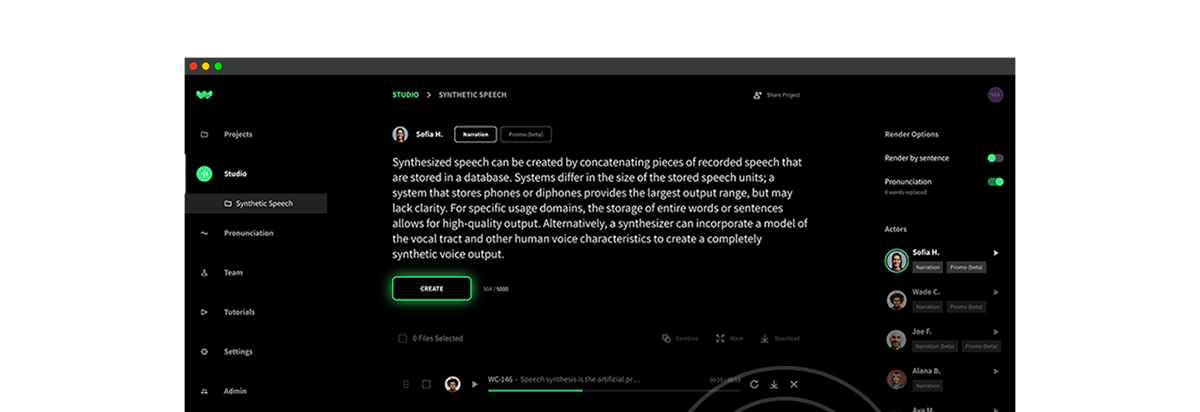
Audio by Eric S. using WellSaid Labs
Remember when PlayStation showcased Project Leonardo at CES back in January? With its adaptive controller made for physically disabled individuals, it showcased an era of inclusivity in tech. But, despite hardware making many strides, in 2021 an analysis of over 30,000 websites found an average of 110 accessibility errors per page. So, we all still have a long road ahead.
After all, a staggering 16% of the population lives with disabilities. This, combined with the ADA’s legal imperatives, means that accessibility isn’t just an added feature—it’s an imperative one. Thankfully, your path to an accessible product might be smoother than you think.
Let’s dive into the 12 ways to ensure you’re on the right track!
Additional reading recommendation: What is the Future of AI Voice?
1. Keys to success
A keyboard isn’t just for typing. For many, it’s the gateway to the web.
Is your site keyboard-friendly? As users hop from one element to another, the sequence should be logical and intuitive. Why? Because not everyone can use a mouse or a touchpad, as many with physical disabilities rely solely on keyboards.
2. Color me accessible
Ever tried reading yellow text on a white background? With an estimated 217 million people having moderate to severe vision impairment, your color contrast matters. Beyond the aesthetic appeal, it’s about making your content readable and inclusive.
3. Lend an ear
Imagine navigating the internet blindfolded. Audio can be a beacon. For content to be genuinely accessible, it needs to be clear, descriptive, and distraction-free. At WellSaid Labs, we believe in delivering this caliber of audio quality, bridging the accessibility gap. Remember, for someone with visual disabilities, your audio might be their primary guide.
Learn more about integrating WellSaid voices into your product here.
4. Write clearly now
Can you read this easily? Text legibility isn’t just a design choice. Rather, it’s a lifeline for older adults and those with visual challenges. Fonts, sizes, and styles should be readable, no exceptions. Keep this front of mind when designing your branding around fonts.
6. HTML’s pecking order
Imagine getting a book’s table of contents at the end. Proper HTML ordering ensures that screen reader users get the most vital information first. Inclusivity lies in the details!
7. Universal languages
Importantly, 13% of U.S. residents speak Spanish. Breaking the language barrier isn’t just good for business–it’s about fostering understanding and trust. Consider what a multilingual support team or translated resources can do for your brand’s inclusivity. In fact, there may be suitable customers out there who just haven’t properly gotten your messages yet.
8. Pictures worth a 1,000 words
Alternative text paints the picture for those who can’t see it. It’s about much more than SEO, it’s about letting every user in on the story. And with 26% of homepage images lacking alt text, you may want to double check on yours.
9. A clearly marked direction
Highlighting titles and sections isn’t just about style—it’s about guiding readers through content. Can your users easily identify different content sections? If not, it’s time for a revamp.
10. Sophistication in simplicity
For those who grapple with complicated texts, brevity is a gift. By simplifying, you’re considering those with neurodiversity, ensuring that the digital world remains open for everyone to learn, explore, and play.
11. ARIA in a pinch–not a handful
ARIA labels are like spices: effective in moderation. They’re crucial for assistive technologies but can be redundant or even detrimental when overused. So before diving into ARIA, ensure you really need it.
12. POUR over your accessibility
TechCrunch coined “POUR” in this piece, emphasizing that content should be Perceivable (adaptable, distinguishable, etc.), Operable (navigable, input modalities, etc.) , Understandable (readable, predictable, etc.), and Robust (compatible for multiple technologies). Does your content tick these boxes? Does your product tick these? Going through a list like this is an extremely valuable add to your building processes across all teams.
Tomorrow’s digital equity
As we look ahead, it’s evident that prioritizing accessibility isn’t just a fleeting trend—it’s the new expectation. At WellSaid Labs, we’re on the front lines of this change, championing AI for good and ensuring our technology serves everyone.
Curious about our stance on ethical AI? Explore our ethics page and see why, for us, innovation and inclusivity go hand in hand.
After all, in a world constantly evolving, shouldn’t our empathy evolve too?


